

Introduction
Imagine the IoT world where everything from your smart fridge to your fitness tracker is connected and constantly giving out information. It's like a big storm of data all around us. But here's the thing - how do we understand it all?
Let's talk about the magic of visualizing Internet of Things (IoT) data! It helps us to make sense of all the data from our smart devices and understand things better.
In our blog, we'll discuss why it's important, the different types, some useful tips, and the best tools. Get ready to learn all about IoT data visualization!
What is data visualization in IoT?
IoT devices have sensors and connectivity capabilities to collect data from different places like environmental conditions, equipment status, and user behavior. Because there is so much complicated data and it's hard to understand and learn from it, that's why IoT data visualization is very important.
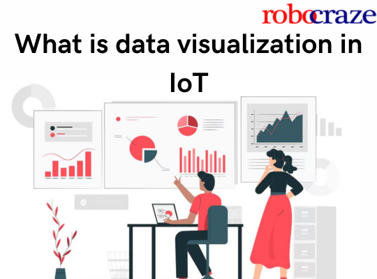
Data visualization in IoT means the process of representing data collected from IoT devices and systems using visual elements such as charts, graphs, and diagrams.

This helps make the complicated data from IoT easier to understand and use, so people can easily extract insights and make informed decisions efficiently. IoT data visualization involves the use of dashboards containing multiple visualization panels, each panel displaying different aspects of the data.
These dashboards give users a complete view of the IoT data in real time. It allows users to monitor system performance, Detect problems, and follow important measurements without any trouble.
Importance of data visualization in IOT:
- Make Complex Data Understandable: IoT data visualization simplifies complex data for easy understanding by using visuals like line graphs and pie charts.
It breaks down technical barriers and helps anyone to interpret data effectively. By presenting insights visually, it promotes identifying patterns and problems to make effective decisions
- Improve Communication: Visualization of IoT data plays a great role in improving communication and collaboration among teams and stakeholders.
By providing a visual representation of data insights, it enables effective sharing of findings, helps in solving problems, and improves outcomes.
- Spotting Inconsistencies and Errors: Visualization tools are super important for spotting inconsistencies and errors within IoT data.
By visually representing data, these tools make it easier to detect discrepancies and inaccuracies. Through graphical representations anomalies and outliers become more apparent which helps users to quickly identify and correct errors.
- Real-Time Monitoring: Visualizing results enables real-time monitoring of outcomes in IoT applications which makes it easier to make changes or fix things as needed.
By presenting data visually, users can easily track key performance indicators and metrics. These KPIs allow users to immediately identify deviations from expected outcomes.
- Bottlenecks Identifying: Visualization plays a crucial role in identifying bottlenecks in supply chains and predicting equipment failure within IoT ecosystems.
By visualizing data from various sources, users can see where things aren't working well in the supply chain. This helps them figure out what needs fixing so operations can run better.
Types of IoT Data Visualization:

- Real-time dashboards: These dashboards are highly customizable, allowing users to monitor key performance indicators (KPIs), trends, and alerts as they happen.
- 3D visualizations: It allows users to explore data from different angles and viewpoints. These visualizations are particularly useful for understanding and visualizing complex IoT data.
- Heat maps and choropleths: It is color-coded maps for visualizing data concentrations and distributions. it helps users to understand spatial patterns in IoT data.
- Graphs and charts: scatterplots for displaying relationships, line graphs for tracking changes over time, pie charts for representing proportions, and bar charts for comparing values, are commonly used visualization tools for IoT data analysis.
- Interactive maps: It allow users to explore geographic data interactively by enabling panning, zooming, and clicking on map elements to access information.
- Augmented Reality (AR) Visualization: It integrates virtual elements into the real world, enhancing interaction with IoT data through devices like smartphones or AR/VR glasses.
- Customized Visualizations: It present IoT data to the specific needs and preferences of users and employs unique graphical representations and interfaces.
Best Practices for IoT Data Visualization:
Being able to visualize and understand IoT (Internet of Things) data is really important to stay competitive and flexible in a world that's always changing. But making useful visualizations for IoT data can be tricky and needs careful thinking.
Below there are some important points that highlight key best practices for IoT data visualization.

Define Accurate Key Performance Indicators (KPIs):
Accurate KPIs are specific metrics that are chosen to measure how well an organization, department, process, or project is doing. These indicators are aligned with the strategic objectives and goals of the entity.
Make sure your visualization matches the goals and Key Performance Indicators (KPIs) of your business, so it's useful and helps meet your needs.
Use Appropriate Visualization Techniques: Use suitable visualization methods to effectively represent data. Choose techniques such as charts, graphs, and maps that best convey the information to the intended audience.
Consider factors like data type, audience understanding, and visual clarity when selecting the visualization approach.
Mobile Responsiveness:
Ensure that the IoT data visualizations are responsive and optimized for viewing on mobile devices such as smartphones and tablets. This involves designing visualizations with layouts, fonts, and interactive elements that adapt seamlessly to different screen sizes and orientations.
By making sure the visualizations work well on mobile devices, users can view and interact with them from anywhere, anytime. This makes them easier to use and more accessible for everyone.
Consider your audience:
Tailor your visualization approach to the characteristics and needs of your audience. Take into account factors such as their level of technical expertise, specific requirements, and preferences.
This ensures that the visualizations effectively communicate the intended message and are easily understood by the audience. By considering the audience, you can design visualizations that resonate with and meet the needs of your target audience effectively.
Ensure accurate and good quality data:
Make sure the data you use for visualization is reliable and relevant by checking that it's accurate and of good quality.
This involves thorough validation and verification processes to confirm the integrity of the data sources. Address inconsistencies, errors, and missing values to prevent misleading insights. By maintaining high standards of data quality and accuracy, you can enhance the credibility of the visualizations and make informed decision-making based on reliable information.
Ensure data is easily understandable and straightforward:
Maintain the simplicity and clarity of visualizations to ensure they are easily understandable and straightforward for the audience. Don't make things too complicated or messy, as it can confuse people who are looking at the visualization.
Emphasize clear labeling, concise design elements, and intuitive navigation to facilitate quick comprehension of the data presented.
Customize dashboards:
Do it to meet the specific needs and preferences of individual users or user groups. Tailor the content, layout, and visualizations to align with the roles, responsibilities, and objectives of different stakeholders within the organization.
This ensures that each user receives relevant and actionable insights that support their decision-making processes and enhance user engagement, satisfaction, and overall effectiveness of data-driven decision-making across the organization.
Provide real-time parameter inputs:
Give users the ability to explore and analyze data by providing real-time parameter inputs. This functionality allows users to adjust variables or parameters within the visualization interface and enables them to see it from different angles and situations.
When people can interact with the data like this, organizations can gain deeper insights into their data and make more informed decisions.
Improve data sharing and communication:
Enhance the sharing and communication of data insights by implementing features that facilitate easy sharing and collaboration among users. Provide capabilities for exporting visualizations in various formats and securely sharing them within or outside the organization.
This ensures that relevant parties have access to valuable insights and can make informed decision-making across teams and departments.
Best Tools for IoT Data Visualization:
IoT data visualization tools come with many features, letting users make interactive dashboards and reports. Below we'll talk about some of the best tools for visualizing IoT data. This helps organizations make smart choices and come up with new ideas in different fields.
Power BI:

Power BI, made by Microsoft, is a strong tool for visualizing data and analyzing it. It connects to many different types of data sources like databases, Excel files, and even streaming data. With its easy-to-use interface, users can change and combine data from lots of sources. It also has many options for making visualizations, so users can create interactive reports with charts, graphs, maps, and gauges.
Tableau:

Tableau is a strong tool for visualizing data and doing advanced analysis. It lets users make interactive charts and visualizations easily, whether they're new to it or experts. You can use Tableau on your computer, through a server, or online, so it works for different kinds of organizations. One great thing about Tableau is that it works with the R scripting language, giving users even more ways to visualize data in detail. Tableau is a popular choice across industries for data exploration, analysis, and presentation, ultimately enabling data-driven decision-making processes.
Amazon QuickSight:

Amazon QuickSight is a tool for business intelligence and visualizing data, provided by Amazon Web Services (AWS). It makes it easy to analyze big datasets and make useful dashboards and reports from different data sources. QuickSight works with many types of data and has lots of ways to visualize it, so users can make interactive and attractive representations of their data. With QuickSight, users can easily explore data, uncover trends, and gain valuable insights to make informed decisions. The service is fully managed and scalable, making it suitable for businesses of all sizes.
Bytebeam:

Bytebeam is a new IoT platform that makes it easy to connect ESP32 Arduino devices and see IoT data right away. With Bytebeam, you can easily bring in data from different sources like sensors and other IoT devices. It works with lots of data sources, making it easy to visualize and analyze data comprehensively. Bytebeam's dashboard is easy to use and can be customized with different widgets, so you can keep an eye on and understand IoT data easily.
Zoho Analytics:

Zoho Analytics is a modern cloud-based software that helps users make data visualizations that fit their organization. With Zoho Analytics, you can look at data from different parts of your organization like marketing, finance, and HR, which helps make decisions based on data. You can use it on the web to explore your data more deeply with customizable dashboards, reports, and interactive charts.
Grafana:

Grafana is a really flexible and strong tool that's open-source, mainly used for showing metrics visually. It works well with lots of different databases like Elasticsearch, MySQL, and PostgreSQL, It lets users ask questions, show data, and get alerts on metrics no matter where they're stored. With Grafana, users can make good-looking dashboards and histograms that can be changed to fit what they need, which is great for looking at data right away and making smart choices.
Benefits of IoT Data Visualization:
- Enhanced understanding of complex IoT data through visual representation.
- Real-time monitoring and analysis of IoT data streams via interactive dashboards.
- Improved decision-making processes driven by clear insights from IoT visualization.
- Identification of patterns, trends, and anomalies for proactive responses.
- Predictive insights and forecasting facilitated by historical data analysis and machine learning algorithms.
- Optimization of resource allocation and utilization based on real-time insights.
- Enhanced scalability and adaptability of IoT systems through visual monitoring of performance metrics.
- Enhanced security monitoring and threat detection through visualization of cybersecurity metrics and anomalies.
- Empowerment of end-users with personalized dashboards tailored to their specific needs and preferences.
- Increased efficiency in troubleshooting and resolving issues by quickly identifying problem areas.
Applications of IoT Data Visualization

- Transportation: Optimizing transportation networks, preventing accidents, and enhancing public transport efficiency through data visualization.
- Logistics: Streamlining vehicular fleet servicing, optimizing cargo operations, and improving hub visualization using IoT data visualization methods.
- Public sector: Identifying criminal offenses, detecting fraud, enhancing financial visibility, and ensuring program productivity through data visualization techniques.
- Environment: Implementing risk reduction strategies, action-oriented schemes, and ecological phenomena analysis using geographic information systems and data visualization.
- Agriculture: Monitoring crop conditions, insuring crops, and claiming damages with insurance companies through data visualization tools.
- Healthcare: Managing crises, overseeing urban activities, tracking healthcare facilities, analyzing demographics, mapping virus spread, and ensuring medical resource accessibility using data visualization in IoT applications.
- Retail: Addressing growth challenges, reducing operational costs, optimizing supply chains, conducting demographic analysis, and maximizing performance using interactive visualizations.
- Various applications such as ride sharing, fleet management, smart homes, grid optimization, customer churn analysis, network reliability analysis, predictive maintenance, and customer satisfaction analysis leverage IoT data visualization.
Conclusion:
Data visualization in IoT is important for making sense of the big amounts of data generated by IoT devices. By simplifying complex data into visual representations like charts and dashboards, it enables better understanding and informed decision-making. Best practices, such as defining accurate KPIs and ensuring data quality, are crucial for effective visualization.
A variety of tools, from Power BI to Grafana, empower organizations to leverage IoT data effectively. The benefits span real-time monitoring, predictive insights, and optimization across industries like transportation, healthcare, and retail. In essence, IoT data visualization is a cornerstone of unlocking the transformative potential of IoT data, driving innovation and efficiency.